One of the most defining features for me in a RPG is the inventory system. How often do I have to go and sell stuff? Can I only bring the bare minimum with me everywhere, or can I horde to my heart’s desire. How easily do I become encumbered, or is that not a thing? How long into the game am I going to get frustrated and toggle the console to boost my carry limit? Am I going to spend 5 minutes looking for that one scroll I need to cast or am I going to be able to find it right away? All of these are things I use to judge whether a game has a good inventory system. With that said this does not mean these are the only things that matter, but rather things that one should be aware of when designing an inventory system for a game.
Some games do a great job of this compared to others. I think one of the main things that got really thinking about this, was a large infographic I saw on the (mis)use of screen space in The Elder Scrolls Skyrim. A vast majority of the screen is used up for the preview of the item. While this does have some usage in the game, I can honestly only think of a handful of quest that require you to move and stare at an item. The second is the amount of text used. A player can easily and quickly scan for an icon, but text requires each thing to be briefly skimmed before knowing if it is the right item which can be slower. With this in mind, I wanted to focus on a couple things for the inventory system in EoS - Good use of screen space, easy to skim and has a good filter/search system. From here on out, I’d like to take you through step by step of what I was thinking as I went through this part of the design phase.
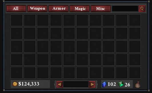
So starting out, I wanted to make use of the space I had. This immediately gives off a very Morrowind feel because it fits a lot of the criteria I set. However, it still has issues. The search bar is too small to be useful, and there isn’t enough space at the bottom for proper display of the various currencies. This is a bit of a problem, so we’ll have to change things up…
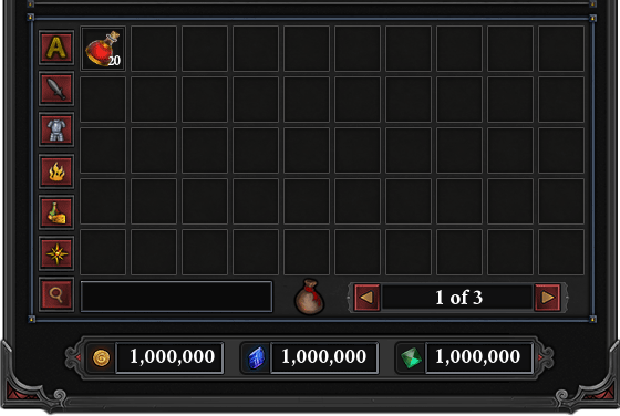
They say a picture is worth a thousand words, so I replaced all of the filter buttons text with images. It’s a nice change, and frees up some more space. However, if I have a lot of things in my inventory, it’s a bit inconvenient to have to use the page selector at the bottom; the most used bits of the UI should be placed closer together to minimize the amount of moving around a player has to do. Which leads us to version #3.
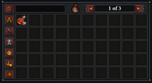
Let’s be honest here, all that has really happened is the bottom row became the top row. It’s a bit better, but the search shouldn’t be the most prominent thing. If the most used thing in my system is the search bar, I’ve designed it wrong. At this point I decided to make a few more tweaks which leads us to the next version, mostly so i can maximize use of screen space.
Just like that, we’re done! Or so I thought.
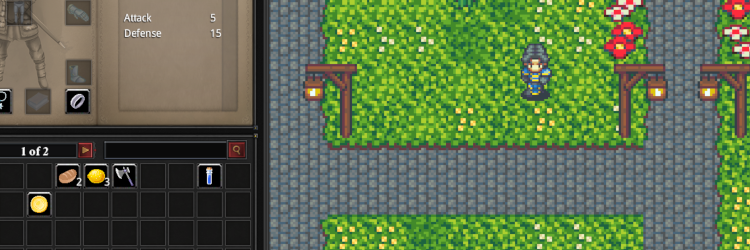
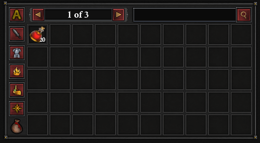
It’s important to do usability test with someone other than yourself. It’s pretty obvious you know where everything is and what it does, because you designed it! I ended up showing the previous photo to a few people and asked some basic questions of what do you think the filters would be if you had no tooltips, etc. The one thing people got tossed up on was the “A” icon for all, and some were unsure about the last filter, which is the general misc./catch all filter, but most got it. Thus, the real final version ended up looking like this, shown within the context of the character sheet.
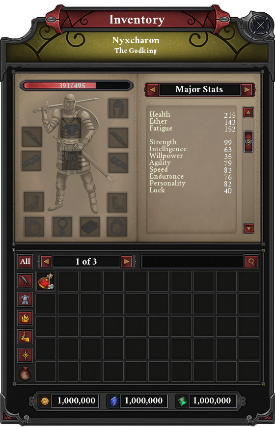
No system is perfect, but this strikes a good balance between what features I decided to focus on. It makes use of all of the space that it has, it has some common filters to make it easier to quickly find an item, aand it also has a search bar incase you can’t find a particular item. Another nice feature it has that wasn’t featured in this design is the trash system. You can denote an item as trash by right clicking it and selecting “Mark as Trash”. Then, you can either go to any NPC vendor and click “Sell all Trash” or just delete it all at once with a click. This makes it easy to mark loot you pick up as something you want to sell so you do not have to figure out which of your 27 swords you want to equip or quickly get rid of things you don’t care about.


